
A Distinctive Visionary..Omaleimainen visionääri
Ritva Puotila, co-founder of Woodnotes, is one of Finland’s most internationally renowned textile artists. She has been awarded the Gold Medal at the Milan Triennale, and her work has been included in the collection of the prestigious Museum of Modern Art MoMA in New York. ..Woodnotesin toinen perustaja Ritva Puotila on yksi Suomen kansainvälisesti tunnetuimpia tekstiilitaiteilijoita. Hänet on palkittu Milanon triennaalin kultamitalilla ja hänen työnsä on päässyt maineikkaan MoMA:n modernin taiteen museon kokoelmiin New Yorkissa.
“I have always seen my artistic work and Woodnotes as a single whole. The different aspects have nourished each other,” Ritva Puotila has said. ..”Olen aina nähnyt taiteellisen työskentelyni ja Woodnotesin yhtenä kokonaisuutena. Eri puolet ovat ruokkineet toisiaan”, Ritva Puotila on sanonut.
Dialogue has always characterized Puotila’s way of working and her relationship with the surrounding world. Throughout her career, it has been impossible to separate her artistic practice from Woodnotes products. Many ideas first emerged through her artistic work and were then further developed in Woodnotes products — and through that process she might gain new insights that would again find their way into her art. And vice versa. ..Puotilan työskentelytapaa ja suhdetta ympäröivään maailmaan on aina leimannut dialogisuus. Hänen urallaan taiteen tekemistä ja Woodnotesin tuotteita ei voi erottaa toisistaan. Monet ideat ovat ensin syntyneet taiteellisen työskentelyn puolella, ja Woodnotesin tuotteissa Ritva on kehitellyt ideaa eteenpäin – ja kenties saanut prosessin myötä jonkin oivalluksen, jota on taas voinut kehittää eteenpäin taiteessaan. Ja toisin päin.
However, the path to becoming an internationally recognized textile designer and co-founder of Woodnotes was a multifaceted one. ..Polku kansainväliseksi tekstiilisuunnittelijaksi ja Woodnotesin perustajaksi on kuitenkin ollut monivaiheinen.
A Colorist with an Unfailing Eye..Koloristin pettämätön värisilmä
Puotila was born in 1935 in Vyborg to a Karelian family that had to evacuate during the war. As a child she drew and painted, and in 1954 Puotila moved to Helsinki to study decorative painting and stage design at the Institute of Industrial Arts. ..Puotila syntyi vuonna 1935 Viipuriin karjalaiseen perheeseen, joka joutui lähtemään sota-aikana evakkoon. Lapsena hän piirsi ja maalasi, ja vuonna 1954 Puotila muutti Helsinkiin opiskelemaan Taideteolliseen oppilaitokseen koristemaalauksen ja lavastustaiteen linjalle.
During her studies she constantly received praise for her sense of color, and throughout her career she has been distinctly known as a colorist. Puotila’s unfailing eye for color forms the backbone of the Woodnotes collection, and in her art textiles colors have shone with a distinctive brilliance for decades. ..Opiskeluaikanaan Puotila sai jatkuvasti kiitosta väritajustaan, ja hän onkin ollut koko uransa ajan leimallisesti koloristi. Puotilan pettämätön väritaju on Woodnotesin malliston selkäranka, ja hänen taidetekstiileissään värit ovat loistaneet vuosikymmenien aikana omaleimaisen erottuvina.
Already during her studies Puotila took part in rya competitions, and encouraged by the success she achieved there, she founded Studio Ritva Puotila in 1960 immediately after completing her studies. She began producing artworks and commissioned pieces and participating in design competitions. ..Puotila osallistui jo opiskeluidensa aikana ryijykilpailuihin ja niissä saadun menestyksen innoittamana hän perusti heti opintojen päättymisen jälkeen vuonna 1960 Studio Ritva Puotilan. Hän alkoi tehdä taidetta ja tilaustöitä, osallistua suunnittelukilpailuihin.
Later that same year, at only 25 years old, she won the Gold Medal at the Milan Triennale for her rya rug ‘Zeus’. In the rya designs of the 1960s, deep red and blue-violet glow intensely, and the visual language is strongly graphic yet vibrant and archaic. The names of the ryas first emerged from classical mythology, later from the names of people close to her, and eventually from Finnish nature and folklore: ‘On a Tussock in the Forest’, ‘Spell’, ‘Will-o’-the-Wisp’… ..Vielä saman vuoden aikana, vain 25-vuotiaana hän voitti Milanon triennaalin kultamitalin ryijyllään ‘Zeus’. 1960-luvulla syntyneissä ryijymalleissa hehkuvat syvänpunainen ja sinivioletti, ja muotokieli on voimakkaan graafista mutta elävää, arkaaista. Ryijyjen nimet kumpusivat ensin antiikin mytologiasta, sitten läheisten nimistä ja lopulta niitä alkoi versota suomalaisesta luonnosta ja kansaperinteestä: ‘Metsässä mättäällä’, ‘Loitsu’, ‘Virvatuli’...
Ritva Puotila won the Gold Medal at the Milan Triennale for her rya rug ‘Zeus’. The picture shows a detail of the art piece./ Ritva Puotila voitti Milanon triennaalin kultamitalin ryijyllään ‘Zeus’. Kuvassa on yksityiskohta teoksesta.
‘The Day the Ice Broke’ was the first rya in which Puotila drew powerful inspiration from nature: from the sea, where drifting ice floes seemed to flee in lines. In the alternation of white and pale gray Puotila saw an interesting rhythm — a compositional idea. Since then, the colors of Finnish nature throughout the seasons and the rich textures of the natural world have influenced many of Puotila’s art textiles as well as her functional designs. ..’Sinä päivänä jäät lähtivät’ oli ensimmäinen ryijy, johon Puotila sai voimakkaan inspiraation luonnosta: mereltä kuin viivoittain pakenevista jäälautoista. Puotila näki valkoisen ja vaalean harmaan vuorottelussa kiinnostavan rytmin, sommitteluidean. Sittemmin suomalaisen luonnon värit eri vuodenaikoina ja rikkaat luonnon tekstuurit ovat vaikuttaneet moniin niin Puotilan taide- kuin käyttötekstiileihinkin.
A Successful International Career..Menestynyt kansainvälinen ura
In 1961 Puotila’s career took a major turn when she won an invitation-only competition organized by the American company Dansk Designs and was invited to design a collection of table textiles for the company. The collaboration continued for decades, and Puotila’s aesthetic became well known and sought after in the United States. ..Vuonna 1961 Puotilan ura sai merkittävän käänteen, kun hän voitti yhdysvaltalaisen Dansk Designsin järjestämän kutsukilpailun ja pääsi suunnittelemaan yrityksen pöytätekstiilimallistoa. Yhteistyö jatkui vuosikymmeniä, ja Puotilan estetiikasta tuli Yhdysvalloissa tunnettua ja haluttua.
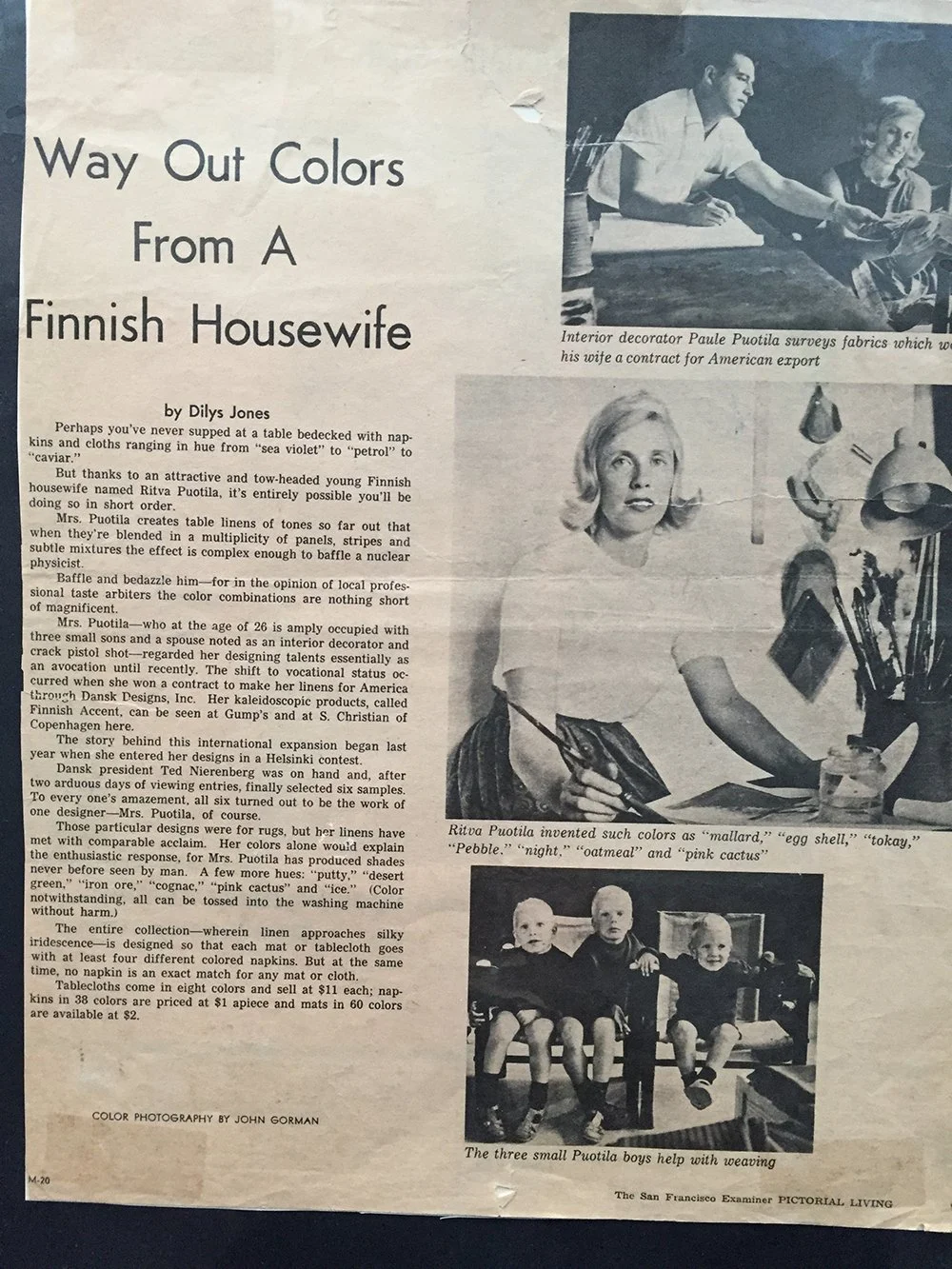
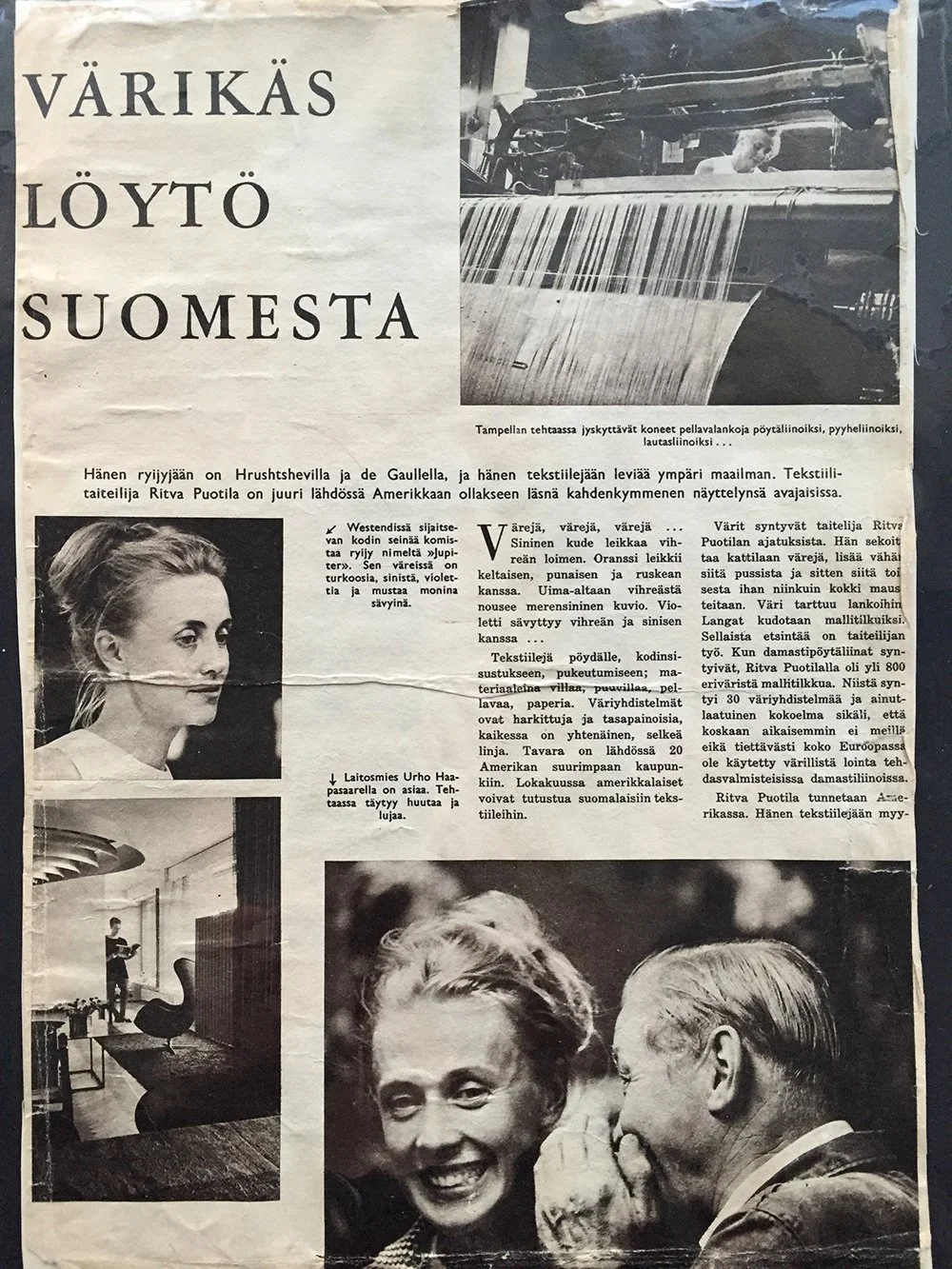
As a freelance designer, Puotila worked for many international companies, including the Swedish Denbo AB and the Swedish-Swiss fashion companies Made In and Made in European Fashion. Around the same time Puotila also gained her first experience designing carpets for industrial production: she designed brightly colored and boldly patterned rya carpets for the Finnish-American company Finnrya for 23 years, until the company was eventually discontinued. All of these collaborations were marked by bold exploration, experimentation with materials, and Puotila’s naturally strong and distinctive use of color. ..Puotila suunnitteli vapaana suunnittelijana monille eri kansainvälisille tahoille, esimerkiksi ruotsalaisille Denbo Ab:lle sekä ruotsalais-sveitsiläisille Made In - ja Made in European Fashion -muotiyritykselle. Samoihin aikoihin Puotila sai myös ensimmäisen kosketuksen teolliseen tuotantoon suunniteltuihin mattoihin: hän suunnitteli suomalais-amerikkalaiselle Finnryalle teollisesti valmistettuja räiskyvän värisiä ja muhkeakuvioisia ryijymattoja 23 vuoden ajan, siihen asti kunnes Finnrya lopetettiin. Kaikkia yhteistöitä leimasi rohkea uuden tutkiminen, materiaalikokeilut ja Puotilalle luontainen vahva ja omaleimainen värienkäyttö.
Alongside her commercial design work, Puotila continued creating art, and her art textiles were constantly exhibited abroad. Her visibility was especially strong in the United States, and one of her works entered the collection of the Museum of Modern Art MoMA in New York. ..Puotila teki taidetta koko ajan kaupallisen suunnittelutyön rinnalla, ja hänen taidetekstiilinsä kiersivät jatkuvasti ulkomailla näyttelyissä. Etenkin näkyvyys Yhdysvalloissa oli suurta, ja Puotilan teos on päässyt New Yorkin modernin taiteen museon MoMa:n kokoelmiin.
Her own artistic practice gradually became freer and more intuitive in expression. By the 1980s patterns had almost completely disappeared. What remained were colors — their dialogue and rhythm, carefully refined proportions, and overall form. The art textiles of the 1980s feel almost immersive in their three-dimensionality, created purely through the use of color. ..Oma taiteellinen työskentely muuttui koko ajan ilmaisultaan vapaammaksi, intuitiivisemmaksi. Kuviot alkoivat 1980-luvulle tultaessa kadota lähes täysin. Jäljelle jäivät värit, niiden keskustelu ja rytmi, viimeisen päälle hiotut mittasuhteet. Kokonaismuoto. 1980-luvun taidetekstiilit tuntuvat lähes upottavilta kolmiulotteisuudessaan, joka syntyy värienkäytöllä.
In 1986 Puotila held her first major solo exhibition. She designed a partly retrospective exhibition at the 500-square-meter Galleria Otso, presenting both her art and functional textiles: enormous monumental ryas made with linen and wool yarns. ..Vuonna 1986 Puotila piti ensimmäinen laajan yksityisnäyttelynsä. Hän suunnitteli 500-neliöiseen Galleria Otsoon osittain retrospektiivisen näyttelykokonaisuuden, jossa oli esillä sekä hänen taide- että käyttötekstiilejään: valtavia monumentaaliryijyjä, joissa oli käytetty pellava- ja villalankoja..
A decisive development for the future was that in a few of the artworks she experimented with an entirely new material: paper yarn. Puotila had always been interested in plant fibers, and during her work trips to the Far East she began to reflect on what constitutes a Finnish textile and what Finnish materials might be. Paper and wood, of course — although at the time this idea was far from obvious. ..Tulevaisuuden kannalta ratkaisevaa oli se, että muutamassa taidetekstiilissä hän oli kokeillut aivan uutta materiaalia: paperinarua. Puotilaa oli aina kiinnostanut kasvikuidut ja työtehtävillään Kaukoidässä hän oli alkanut pohtia mitä on suomalainen tekstiili ja mitkä ovat suomalaisia materiaaleja. Paperi ja puu, tietenkin, vaikka asia oli tuolloin kaikkea muuta kuin ilmiselvä.
“I have always been fascinated by the everyday beauty of paper,” Puotila has said. “Paper is a fiber of its own kind. It is light, and colors glow on its white surface. The unbleached natural tone of paper is beautifully pure as it is.” ..”Minua on aina kiehtonut paperin arkinen kauneus”, Puotila on sanonut. ”Paperi on omanlaisensa kuitu. Se on kepeä, värit hehkuvat sen valkoisella pinnalla. Paperin valkaisematon luonnonvärinen sävy on puhtaan kaunis sellaisenaan.”
Ritva Puotila: “Paper is a fiber of its own kind. It is light, and colors glow on its white surface. The unbleached natural tone of paper is beautifully pure as it is.” / Ritva Puotila: ”Paperi on omanlaisensa kuitu. Se on kepeä, värit hehkuvat sen valkoisella pinnalla. Paperin valkaisematon luonnonvärinen sävy on puhtaan kaunis sellaisenaan.”
The Birth of Woodnotes..Woodnotes syntyy
Puotila’s son Mikko Puotila became excited about the innovative material, paper yarn, and suggested to his mother that they establish a company producing home textiles from it. Puotila immediately embraced the idea. ..Puotilan poika Mikko Puotila innostui uudesta innovatiivisesta materiaalista, paperinarusta, ja ehdotti äidilleen, että he perustaisivat yrityksen, joka valmistaisi paperinarusta kodin tekstiilejä. Puotila oli heti mukana yritysideassa.
“Finland is a country of forests and paper — why couldn’t it be used in other ways as well?” ..”Suomi on metsän ja paperin maa, miksei sitä voisi käyttää toisillakin tavoin?”
Woodnotes was founded on March 15, 1987. ..Woodnotes perustettiin 15.3.1987.
Woodnotes was noticed immediately. The products, with their graphic forms and harmonious color palette, seemed to contain something new — yet at the same time something timelessly classical. Puotila designed the Woodnotes collection drawing on everything she had learned around the world: a product had to be functional and durable. ..Woodnotes huomattiin oitis. Graafisissa ja värimaailmaltaan harmonisissa tuotteissa tuntui olevan jotain uutta – ja samalla ikiaikaisen klassista. Puotila suunnitteli Woodnotesin mallistoa hyödyntäen kaikkea sitä, mitä oli oppinut maailmalta: tuotteen piti olla funktionaalinen ja kestävä. Sen muotokielen ja väriharmonian tuli olla myös aikaa kestäviä.
Its visual language and color harmony also had to stand the test of time. Puotila wanted to create products that do not demand attention but instead naturally converse with the rest of the home interior. ..Puotila halusi luoda tuotteita, jotka eivät huuda huomiota itseensä, vaan jotka keskustelevat luontevasti kodin muun sisustuksen kanssa.
Even today many homes still use products from the very first Woodnotes collections. They exist side by side with newer ones. Carpets from different eras can also easily be combined because the shades always harmonize beautifully — just as they do in nature. ..Monissa kodeissa onkin edelleen käytössä aivan ensimmäisten Woodnotesin mallistojen tuotteita. Ne toimivat rinta rinnan uudempien kanssa. Eri aikakausien mattoja voi yhdistää siksi helposti, että sävyt sointuvat aina kauniisti yhteen – samalla lailla kuin luonnossa.
Art and Design Living Side by Side ..Taide ja design elävät rinnakkain
Alongside Woodnotes, Puotila continued exploring paper yarn in her unique artworks. She tested the material and its possibilities in ever new art textiles. ..Puotila jatkoi paperinarun tutkimista uniikkitöissään Woodnotesin rinnalla. Hän testasi materiaalia ja sen mahdollisuuksia yhä uusissa taidetekstiileissä.
Puotila has often emphasized how important a material-driven approach is to her: exploring the potential of the material itself. Woodnotes would never have come into being without Puotila’s curiosity and her way of approaching new materials through art. ..Puotila on usein korostanut, miten tärkeää hänelle on materiaalilähtöisyys: materiaalin potentiaalin tutkiminen. Woodnotesia ei olisi syntynyt ilman Puotilan uteliaisuutta, tapaa lähestyä taiteensa kautta uusia materiaaleja.
“I have wanted to explore the possibilities of paper yarn, to continually find new ways of approaching it. It is a fascinating and multidimensional fiber — a material you can converse with endlessly. I have also wanted to expand the Woodnotes collection gradually and thoughtfully. In the products, the overall composition is important: structure, the proportions of color, subtle variations in tone and rhythm,” Puotila has said. ..”Olen halunnut tutkia paperinarun mahdollisuuksia, löytää siihen aina uusia lähestymiskulmia. Se on kiehtova ja moniulotteinen kuitu, materiaali, jonka kanssa voi keskustella loputtomiin. Woodnotesin mallistoa olen halunnut laajentaa pikkuhiljaa ja ajatuksella. Tuotteissa tärkeää on kokonaisuus, rakenne, värien mittasuhteet, hienovaraiset sävyn- ja rytminvaihdokset”, Puotila on todennut.

Lume, art textile, Ritva Puotila 2005 and New York paper yarn rug. / Lume, taidetekstiili, Ritva Puotila 2005 ja New York paperinarumatto.
Puotila is also fascinated by combining paper yarn with softer materials — both in her art and in the Woodnotes collection. Cotton and wool bring softness to the sculptural quality of paper yarn. Together they seem to converse; they feel alive. Puotila often repeated that everything begins with the right kind of yarn. ..Puotilaa kiehtoo myös paperinarun yhdistäminen pehmeämpiin materiaaleihin: niin taiteessaan kuin Woodnotesin mallistossa. Puuvilla ja villa tuovat veistoksellisen paperinarun rinnalle pehmeyttä. Yhdessä ne ikään kuin keskustelevat, ovat eläviä. Puotila toisti usein, että kaikki alkaa oikeanlaisesta langasta.
Paper yarn is also literally a living material: it is made from northern softwood trees, and perhaps one could think that some of the energy of the tree and forest remains within it. ..Paperinaru on myös kirjaimellisesti elävä materiaali: se valmistetaan pohjoisen luonnon havupuista, ja ehkä voi ajatella, että jokin puun ja metsän energia jää myös paperinaruun.
Pure Presence..Puhdasta olemassaoloa
Puotila is a master of scale. In the products she designs, shapes and colors are in exactly the right relationship with one another — and also in the right relationship with the surrounding space, whatever its size or character may be. Central to Puotila’s work was empathy: entering into the space and its functions, understanding the space in relation to people. ..Puotila on mestarillinen mittakaavoissa. Hänen suunnittelemissaan tuotteissa muodot ja värit ovat juuri oikeassa suhteessa toisiinsa. Ja myös oikeassa suhteessa ympäröivään tilaan – oli se millainen tai minkä kokoinen tahansa. Keskeistä Puotilan työskentelyssä oli eläytyminen – tilaan ja sen toimintoihin, tilan hahmottamiseen suhteessa ihmisiin.
In Puotila’s carpets, curtains, and art textiles, the rhythm of patterns and colors is symmetrical, but the material itself and the handmade surface bring an organic counterforce. The result is at once controlled and alive. ..Puotilan suunnittelemien mattojen, verhojen ja taidetekstiilien kuvioiden ja värien rytmi on symmetrinen, mutta itse materiaali ja käsintehty pinta tuovat orgaanista vastavoimaa. Kokonaisuus on samaan aikaan hallittu ja elävä.
It is as if Puotila repeatedly manages to find the natural rhythm of things — the form of pure existence. Perhaps that is why Woodnotes carpets are so often said to radiate calmness into their surroundings. ..Aivan kuin Puotila onnistuisi kerta toisensa jälkeen löytämään asioiden luontaisen rytmin, puhtaan olemassaolon muodon. Ehkä siitä syystä Woodnotesin matoista sanotaan niin usein, että ne säteilevät levollisuutta ympärilleen.
Sources for the article include the publication Ritva Puotila (Design Museum, 2003), and articles written by Carla Enbom and Leena Svinhufvud. ..Jutussa on käytetty lähteenä julkaisua Ritva Puotila (Designmuseo 2003), ja sen Carla Enbomin ja Leena Svinhufvudin kirjoittamia artikkeleita.